
Huge news! A couple of weeks ago I collected four Eastern Black Swallowtail caterpillars as pets. They have since eaten a ton of parsley and wrapped themselves up in cocoons for the winter. Hopefully I'll have four butterflies to release in March, I'm pretty pumped about it. So this pet caterpillar adventure of mine got me thinking about Eric Carle's popular children's book, The Very Hungry Caterpillar, published in 1969. Here is my favorite page from the book:

It is so simple and yet so striking. The bright yellow sun takes up almost half the space. Its imperfect orange and yellow rays help point your eyes straight to that goofy demeanor, which is easy to spot but still a bit subtle. Following the sun's gaze, the little green caterpillar is a clear contrast to the bright yellow next to it and the white sky further emphasizes the bold colors it surrounds. The sun, the tiny green caterpillar, the brown ground, and the white sky filling the rest of the space. Four incredibly simple elements used in a way to create a really great illustration.
Side note. Since this is a mainly white picture on a white backgrounded blog, I've added a black border below to isolate the image a little better:

To further explore the relationships between these objects and why Carle's illustration is so crab-snappin' awesome, I've gathered several artworks of various media that use a comparable system of placement, size, and spacing in their composition.
Elizabeth Gadd's wintery photograph Solitude below, mimics the above image in a lot of ways. The ground occupies a fairly straight thin line. The tree and the person next to it have a similar size relationship to the sun and caterpillar. Carle's illustration captures a childlike happiness, but with its massive sky and limited color variation, Gadd's photograph trades playfulness for that winter quiet that comes with a good blanket of white snow. The sky gently transitions from navy to a soft, almost orange, a light source that our subject is walking towards much like that little caterpillar inching towards a big, happy sun.

It is apparent though that the two objects here are much closer together compared to those in Carle's illustration. To explore this difference I have crudely photoshopped the girl further away from the tree:

By separating these objects from being almost one to so distinctly far apart, it immediately lessens the impact of the vast expanse of sky. This separated spacing works well for Carle's illustration because the sun already takes up a lot of area, it needs that bit of room to breathe. But in Gadd's photo the sky is the largest object. It makes the figure look small next to the immensity of nature and by making the sky feel smaller, this idea does not come across as strongly. In conclusion, props to Elizabeth Gadd for temporarily transporting me to the peace and quiet of a sparse winter wonderland.
Ok, check out this image from Spike Jonze's movie adaptation of Where the Wild Things Are. (Which I actually don't think is an actual shot in the film, as I watched the whole thing and never saw it. I'm pretty sure it's a promotional image. Either way it's a beautiful shot.) The spatial relationships in this image share similarities with Carle's illustration of a slightly different kind than Gadd's photograph. The largest object, the tree, takes up almost half of the image space (much like Carle's yellow sun), as the smaller object (2 in this case) walk beside it.

There is even less color variation in this image than in Gadd's winter scene and with so little variation in shadow as well, these figures are almost completely silhouettes. What I find particularly elegant about this image is the relationship of Max (the figure running) to the Wild Thing in front of him and the tree behind him. Together, they create a nicely framing arc of space around the boy, drawing your eye right towards him. Also, notice how that little shrub on the very left balances the big wild thing on the right. By photoshopping it out below, the content becomes more centered and loses much of its horizontal flow. This little shrub has no significance in terms of the action within the frame but it is incredibly important in terms of composition.
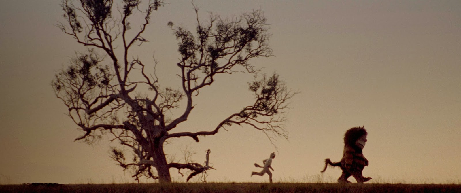
Now by moving the tree to hug the side of the picture like Carle's sun does, the horizontal flow has returned, just with a slightly different flavor:

Carle's illustration horizontally flipped for comparison:

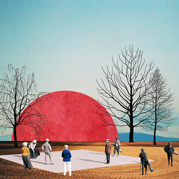
Moving on, when I look at Oleg Borodin's collage the first thing I notice is that great big red sun taking up some ample space on the horizon. What is not so immediately obvious is that the basic arrangement of the work is made up of several flat and simple geometric shapes. The white diamond on the yellow rectangle of ground in the foreground and the red half circle sitting on a blue rectangle of sky in the background. The more organic shapes of the trees and people milling about help to break up this crisp and clean content and keep it from feeling rigid. Carle's illustration does not need other objects for this purpose as his shapes are already so imperfect in themselves.

Is it just me or does that feel a bit chlostrophobic? How about this:

That's better. Ok, so I think this image works, but the red sun is definitely much more dominating than the original collage. The bit of sky and flat red does do a decent job of balancing the other content but I think Borodin's original collage allows for much more breathing room for both the large sun and the clutter of activity around it. Another important aspect is that this cropped image is much more akin to the traditional dimensions of a landscape, which is perhaps why Borodin's collage feels more original. It does not adhere to a design we are used to seeing.
So since I'm already on a cropping roll, what happens if we crop the foreground to imitate the previous works we've looked at?

And here the largeness of the red sun becomes especially conspicuous. It is much more dominating here than our happy yellow sun below, as it takes up almost two thirds of the horizon and has no rays around it to loosen up its size. This red sun is also a very simple object in itself with its almost-flat red color and smooth sides, so the variety in the work comes in with the figures around it. With its uneven edges, variation in color, and a silly face, Carle relies on the variety to be the sun itself.

I remember in elementary school learning that Eric Carle makes his pictures by painting pieces of paper, letting the colors dry, and then cutting them up to make his collage. It looks like Brooklyn-based artist Paul Wackers uses a similar technique in some of his work. The Meander, from his 2013 series, Always Somewhere, is made of acrylic and spray paint on panel. The way some of the objects (like the white vase, the vertical lines, and the round black and blue object all the way to the left), have textures that show a variation of paint that stops cleanly on the edges suggests to me some kind of collage action happening there as well.

Wacker's painting is a good example of how to apply the positional and spatial theme we've explored in Carle's illustration in a more complex and subtle way. The big plant and the rocks around it take the place of the yellow sun and the vase on the right takes the place of the caterpillar. The addition of imperfect vertical lines add color, dimension, and energy to the work.
One last piece! And possibly my favorite in this post. This tree in Waiting Tree, 2012, by Jules de Balincourt is absolutely dazzling. It confidently fills the entire space and I love the bright but pale pinks and greens of the tree against the deep navies and purples behind it.

Eric Carle's caterpillar illustration is from a picture book, therefore on most encounters with the picture there would be a great big crease down the center where the pages bind together. With this in mind, the sun would take up pretty much all of the right side of the spread. Just like the beautiful tree above, this sun fills the space with no apology and those bursts of rays run outward not unlike the tree limbs groping towards the edges of their frame. Both these works have a thin ground to give a touch of stability to a very proud and energetic object.

Well, that's why I like The Very Hungry Caterpillar, but I want to finish with one last thought. In the English language we read from left to right, so we are used to things starting on the left. What does it say about these works considering that in Carle's illustration and Gadd's photograph the weightiest or largest objects are on the right; compared to the Where the Wild Thing Are movie shot, Borodin's collage, and Wacker's painting, in which the weightiest and largest objects sit on the left? Or does it say anything at all? You decide.
That's all!
No comments:
Post a Comment